Medical software Heatmapanalysisvisualization2D
Add to favorites
Compare this product
Characteristics
- Applications
- medical
- Function
- analysis, visualization
- Type
- 2D
Description
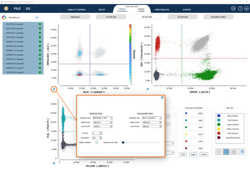
The heatmap visualization is a convenient analysis tool to delimit 2D zones. In heatmap visualization mode, the colormap represents the different droplet density levels in the fluorescence populations. Droplet densities are visualized utilizing a color gradient displayed on the second y axis. Low droplet densities are represented by shades of colours on the lower axis (light grey) while increasing droplet densities are color coded in shades of blue, green, yellow and red representing the highest droplet density.
To activate the heatmap visualization in 2D dot plots, open plots settings and check the “Display heatmap” checkbox.
The color scale on the right of the graph gives the complete color range that is used to represent the different density levels.
Most of the time, the negative population is very dense, which has the effect of hiding smaller density variations between less dense areas. The Heatmap color scale parameter can be modified to highlight populations of lower density levels.
Catalogs
No catalogs are available for this product.
See all of Stilla Technologies‘s catalogsRelated Searches
*Prices are pre-tax. They exclude delivery charges and customs duties and do not include additional charges for installation or activation options. Prices are indicative only and may vary by country, with changes to the cost of raw materials and exchange rates.


